Case study · Energy drink brand
Five flavours, one promise (energy without the crash), and a straight line to checkout.
A full rebuild of a zero-sugar energy drink's storefront, made to get a thirsty visitor from "what is this?" to a can in their Amazon cart.
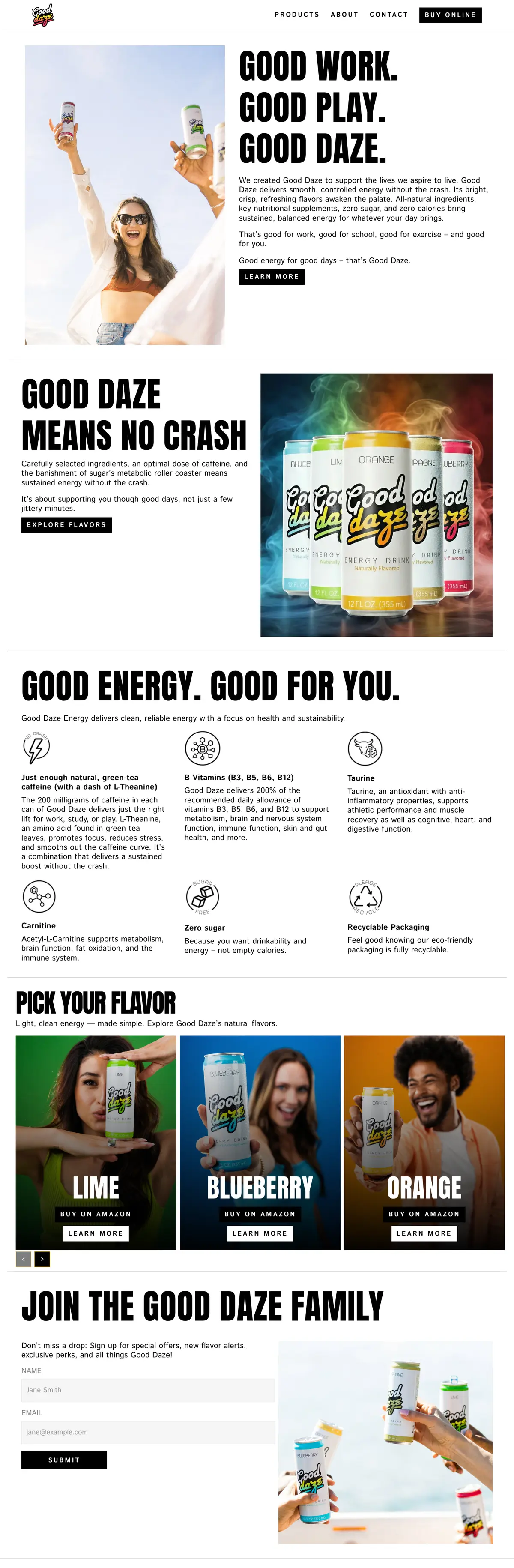

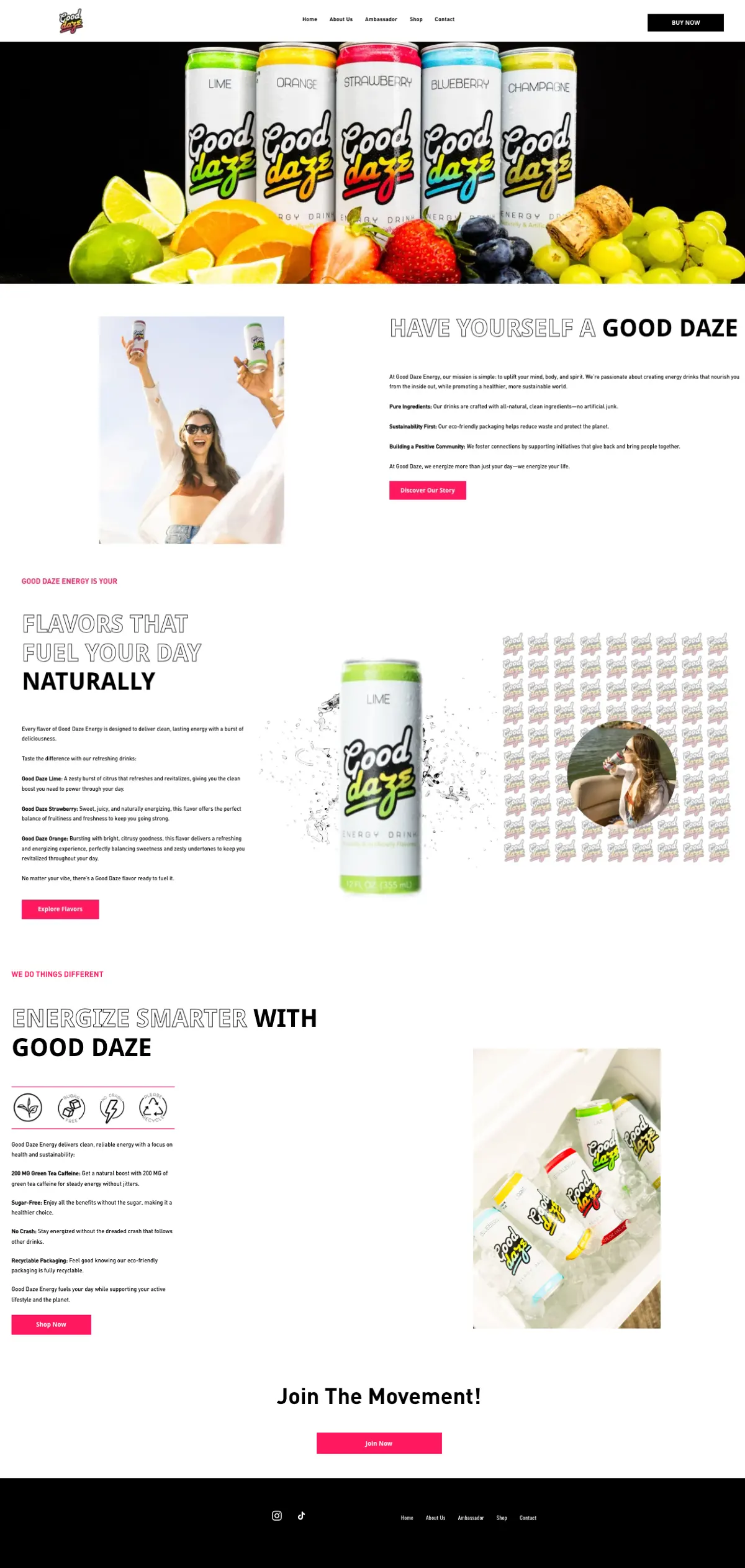
Before, and after.
01
Responsive, properly
The old site was built for one screen size. The new one is laid out for phones first, where most of a drinks brand's traffic arrives.
02
A sharper look
Bolder type, product in motion, and one clear idea per screen instead of long paragraphs in small print.
03
Tested with real users
We watched people use it and changed what tripped them up before launch, not after.
04
Built to convert
Every flavour is one tap from purchase, and the route from landing to buying is shorter. Conversion rates went up.
05
SEO from the ground up
Clean structure, real headings, fast pages and descriptions written for the searches people actually make.
06
Custom assets and video
New product renders and video made for the site, so it no longer leans on a handful of stock-style photos.
The brief
Good Daze makes a zero-sugar energy drink with natural green-tea caffeine. They already had a website; it did not work well on phones and was not selling the product. The new site has two jobs: explain in a few seconds why this can is different from the wall of cans next to it, and send people who are convinced straight to where they can buy it.
What we built
A bold, poster-like site that leads with the product in motion and a three-line promise: good work, good play, good daze. Below that, the case for the drink is laid out ingredient by ingredient in plain language, and every flavour gets its own page with a direct “Buy on Amazon” button.
What it does for them
- The homepage answers “why this one?” before the first scroll ends.
- Each of the five flavours is one tap from purchase.
- A newsletter sign-up collects the people who are interested but not buying today.